
This is a guest post written by @ursboller. It’s a companion to his session at the Adobe virtual Summit 2020: A Minimalistic approach for more insights.
With Adobe Analytics implemented on a website there is almost nothing you can’t measure. Basically every user interaction or app behaviour can be tracked using different codes with Launch, by Adobe. But having a bunch of data will lead to problems maybe sooner than later: You must keep an eye on all changes of the website after go live, you must have a good documentation (use “Documentation 2.0” if you don’t have it yet) and you need time to create the dashboards (even if you want to create “Dashboards without numbers“). But maybe one of the biggest problems: new users need a lot of time to learn and understand Adobe Analytics! Time to think about a new approch that lets you create “perfect dashboards” (more about dashboards from @oarsi and me on perfectdashboard.rocks)
Why do we need a minimalistic approach?
When we started implementing Adobe Analytics on our websites a few years ago we used to track every interaction of the users. Some of them made a lot of sense for us as internal analytics consultants, some not (we just did them because somebody wanted the data). In the end we had a bunch of eVars and custom events with all kind of information. This was great for consultants who know in deep how Adobe Analytics works, how you can create segments and calculated metrics and build fancy dashboards.
But problems started about a year ago when we tried to open the access to interactive dashboards. Our end users (and main stakeholders) didn’t understand how to use the different items. Even starting with long training sessions didn’t improve the situation. People didn’t feel confident about what they have done and skipped accessing Adobe Analytics sooner or later. We more or less stayed in a situation where the Adobe Analytics consultants had a lot of work creating new dashboards with pdf delivery or doing some deep dives for almost every website.
Success Steps for minimalistic approach
With the migration to Launch about 6 month ago we decided to not only “update” but doing a whole “challenge” of the current setup. Do we need that much data (with a lot of work to migrate) or is there a way to make it more simple – ideally without loosing any insight.
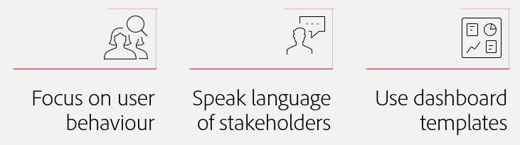
The new approach @jexner and I have chosen for our future implementation of Adobe Analytics consists of the following key points:
In the following section I will explain how we achieved to create the new approach and created a flexible foundation which is both easy to understand and immediately allows everybody in our organisation to start using the data and take actions!
1. Focus on user behaviour
As already said we used to track a lot of user interactions on the website. Just have a look at the following example of a customer journey:

While this is very useful to answer a lot of questions there was no information available what are the really important steps in the customer journey. In most cases business couldn’t answer questions about “key performance indicators” (KPI) and therefore it was almost impossible to define the important tracking points. And while it was difficult to define what is relevant, it was impossible to just skip any data points – maybe we need exactly this information sometime in the future. (side note: have a look at your implementation: how many data points are you tracking and nobody cares about the data?)
Define important steps in the customer journey
What helped us to make a change was a growing knowledge about customer journeys. A few years ago we started to report on top level in an easy way using the generic terms “attract”, “engage” and “convert” (similar to “AIDA” – attract, interest, desire and action). This was maybe the key to change the way we talk about website tracking: we started asking about exactly those three points: what do you see as “attract”, “engage” and “convert” in some example customer journeys? after a discussion with stakeholders the customer journey from above might look like this:

In most cases the “attract” is the visit of a user on the website. Talking about “engage” is more difficult and might end up in more than one tracking point. It can be a download of a specific document or click on a “call to action” (Link click) which leads to the contact form (engagement tracked on the next page to save some server calls). And finally the “convert” can be a form submit (tracked on the confirmation page) or any other interaction the business decides to be the website convert. Talking about customer journeys and relevant interactions helped a lot to reduce the amount of tracking points requested and reduce to the main steps in a (generic) funnel.
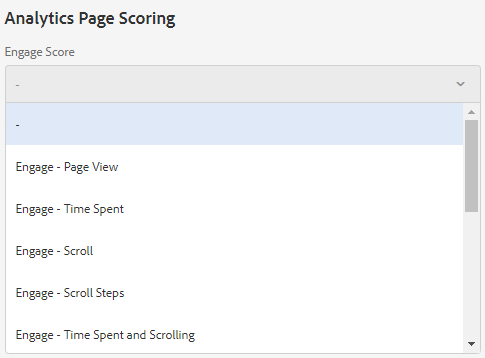
You might ask how to implement this using Adobe Analytics? All you need is to define a new “success event” for each of those steps in the generic customer journey. Since “attract” is defined as “visit” in our case we added two new events for “engage” and “convert”. For the tracking itself using Launch there are the following options:
- Track desired actions individually
Basically you implement a new rule for each of the desired interactions of the end user and track the new success event (or add it to an existing rule). That means it might be similar as you’ve done tracking of single actions in the past. The only difference is you add he generic success event which you’ve defined before. And don’t forget to keep an updated documentation about all the tracking points. - Track actions based on website information
The website could provide information what you need – for example adding the information in the data layer or next to a single page component. For example, the data layer could contain the information that the view of the current page is defined as “engage” (a CMS author would have checked a box). Basically you just setup Launch to watch for those settings on all pages and track accordingly.
(Remark: in a “perfect world” you have all those key interactions as single entries in a data layer and just track the occurence)
AEM Example: In our implementation of AEM we decided to insert both a page setting for “engage” and “convert”. Basically each AEM author can change this setting while creaing (or editing) a single site and select one of the following “engage” events:
Those settings (similar for “convert”) are published on the website in a data layer and can be read by Launch. That means for each of the options we have a rule that triggers based on predefined conditions. For each new AEM website the authors just needs to select the desired settings – there are no additional changes in Launch needed.
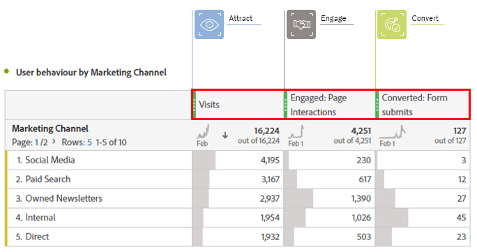
Simple dashboard with generic events
Having those generic events already allow us to create simple dashboards where you can see the defined steps within the customer journey. And thanks to calculated metrics you can even calculate the ratios of visits where users reached the “engage” and “convert” as well as the change over time:
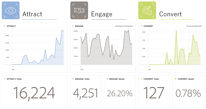
Since the “events” (engage and convert) are defined by the business (and not by analysts!) everybody can read and understand what has happened on the website. This is one of the key points to help people understand the data.
2. Speak language of stakeholders
When we started using the generic events we realized that the definition of “engage” and “convert” is completely different between different parts of our website. Within the “products” there is a real focus on creating leads that hopefully end in business. But for all the websites from the content marketing, the “convert” is completely different (and sometimes really hard to define). But in our “minimalistic approach” we decided to have just two success events which are named for everyone.
Use Virtual Report Suites
That’s why we decided to start to use virtual report suites (VRS) and especially the settings for “component curation” (read more in the Adobe help docs about virtual report suites). The feature to rename the metrics within the VRS is awesome: just give the “generic events” a name all stakeholders understand immediately!
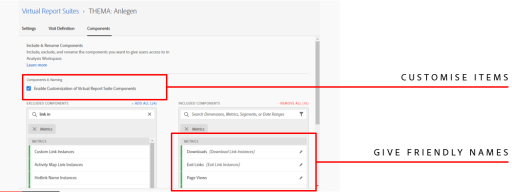
We use VRS for almost all different topics of our website because the stakeholder aren’t interested in every single page we track (at least the most of them). Within the VRS we can give the metrics friendly names based on the language of the stakeholders, of common words they use in everyday work. Those names are displayed all over the report, especially in the tables where we break down the customer journey by marketing channel.
Having the friendly names gives the user much more confidence about the data since they immediately know what it means. They do not need to lookup any documentation and can start using the data without a lot of knowledge.
Different topics and internal referrers
There has been another issue with marketing channels in our organisation: the default marketing channels do not represent what the end user thinks it should be! Just think of an example of an website visitor arriving on one topic and then moving forwards to another topic. In this situation the marketing channel would stick to how the visitor arrived overall and nothing would indicate that the first topic helped drive the visitor towards the second topic.
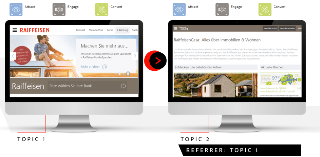
To solve this problem we decided to track the “internal referrer topic”. Basically whenever a visitor enters a new topic, we track from which topic the user arrives (by writing current topic in a cookie and read/compare on the next website). With this additional information available for all topic we can change the table from above and split visits between “internal” and “external”

Just by using a simple segments (“internal referrer exists”) we can detect if the visitor arrives from another topic and the data to the “internal” section. Now the stakeholder can see all the traffic from his own marketing activities which really arrived in the desired topic.
(Note from Jan: Urs is working for a Swiss bank. Their site is more than just online banking. They have a lot of content around mortgages and buying property. They are sponsoring sports. They have a loyalty program for their customers with concert tickets at reduced prices and other perks. There is a lot going on on the site, and a lot of people have very different goals. The topics have always been an interesting challenge.)
Pro Tip: Internal campaigns and more data
We realised that those “topic changes” are the most common cases where we used internal tracking codes. Because the system now detects itself the change of the topic, we can get rid of the internal tracking codes – at least in most cases. But sometimes there are really useful information in the tracking codes which get lost, for example additional informationen about the teaser position or the referring page (you only get the topic). To solve this and some more problems in the reporting we decided to add the following information just for the moment the visitor changes the topic:
- Referring Page (eVar) to see where the user left the previous topic (or where we had placed an internal marketing teaser)
- Topic Entry Page (eVar) to get a real “entry page” for each single topic (since the default “entry page” is based on the whole visit
- Topic first Page View (metric) to easy segments the entry in a topic
- Topic second Page View (metric) to know who had seen a second page (or more important: to create a bounce rate for each single topic)
3. Use dashboard templates
Now it’s time to create dashboards for our stakeholders. In the past we used to setup all kind of dashboards for every topic and stakeholder, most of them sent out either weekly or monthly by pdf. But thanks to workspace templates we changed this as well.
For our end users we added a custom template for a simple dashboard. That means whatever topic the user is interested in (s)he just opens Adobe analytics and starts with the dashboard template. All that needs to be done is selecting the right topic in the upper right corner (report suite selector).
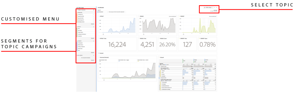
We really love the virtual report suites and the component customisation: Due to the fact that we selected the dimensions and metrics that make sense in the single topic, the left rail just shows those items. This makes it much easier for the new user to decide, what can be used in a single project.
Another advantage we heavely use are segments for different topics. Basically all the marketing campaigns have their own segment, which can be used as a global filter to narrow down the data.
The feedback from our stakeholders is great: they feel very confident in looking at the dashboards and immediately start to make breakdowns, add metrics or their own visualisations. Overall it was one of our best decision to change to this approach!
Remark: for new users, we cancelled all our internal training sessions about any technical backgrounds and directly start to use workspace in most cases.
Too simple? Expand as needed!
If you have ever seen the full power of Adobe analytics and how much data you can have in the reports (especially all different kind of data) you might ask if this is not just too simple and has some drawbacks later on. But to this day, we didn’t find any problems, only advantages.
Just an example: having the dashboards it is just a matter of time that stakeholders are asking about more metrics or dimensions. But this isn’t a big problem, you can give them access either by the VRS settings or by a proper permission management. And thanks to the flexibility of the workspaces the stakeholder can just add any of the desired metrics.
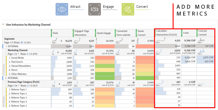
As you can see in the table above you can add almost any of the metrics that are available in the left row. That makes it really easy for the users, just drag and drop what you want to see.
The “simple approach” is not about creating the perfect dashboard for everybody, but to create a simple starting point for all different end users. Try to make the start in Adobe Analytics as easy as possible for the stakeholders and they will love to use it!

4 thoughts on “Minimalistic approach for more insights”